
Today’s topic was supposed to be all about your favorite cover fonts, but I’m going to be honest with you all, I’m much more of a fan of the overall than the minor, therefore, my post will be about my favorite covers.
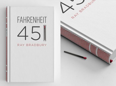
1. Fahrenheit 451 — Ray Bradbury
This is a special edition cover, but I think it is beautiful. First of all, you can light the match on the book, second of all, you can bun the book, which is the whole premise of the story. I think it is amazingly well connected to the story as well as good looking.
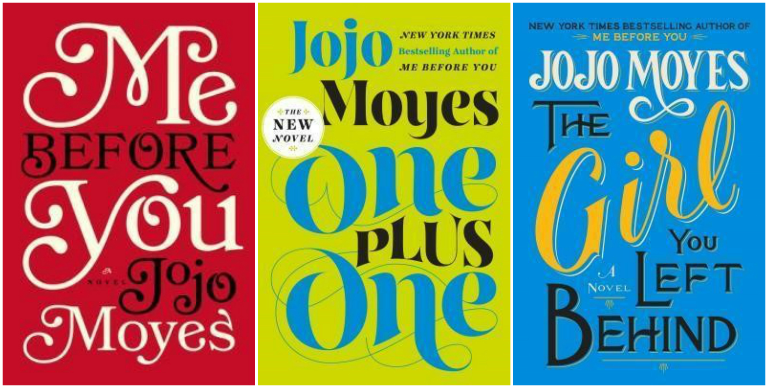
2. Me Before You (etc.) — Jojo Moyes
I love the fonts on these books, and I love how the fonts are used to fill up the cover so that the cover art is the title. I think it is very classic looking and elegant.
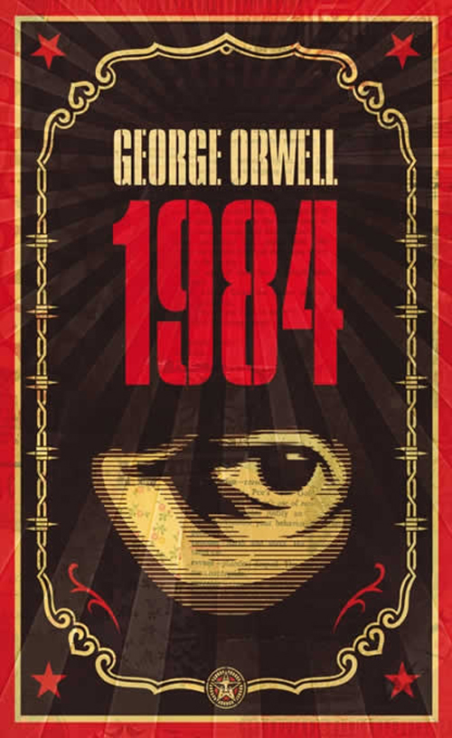
3.1984 — George Orwell
I love this cover art for this book. Not only is it my favorite novel, but I think this cover in particular is really interesting and eye catching.
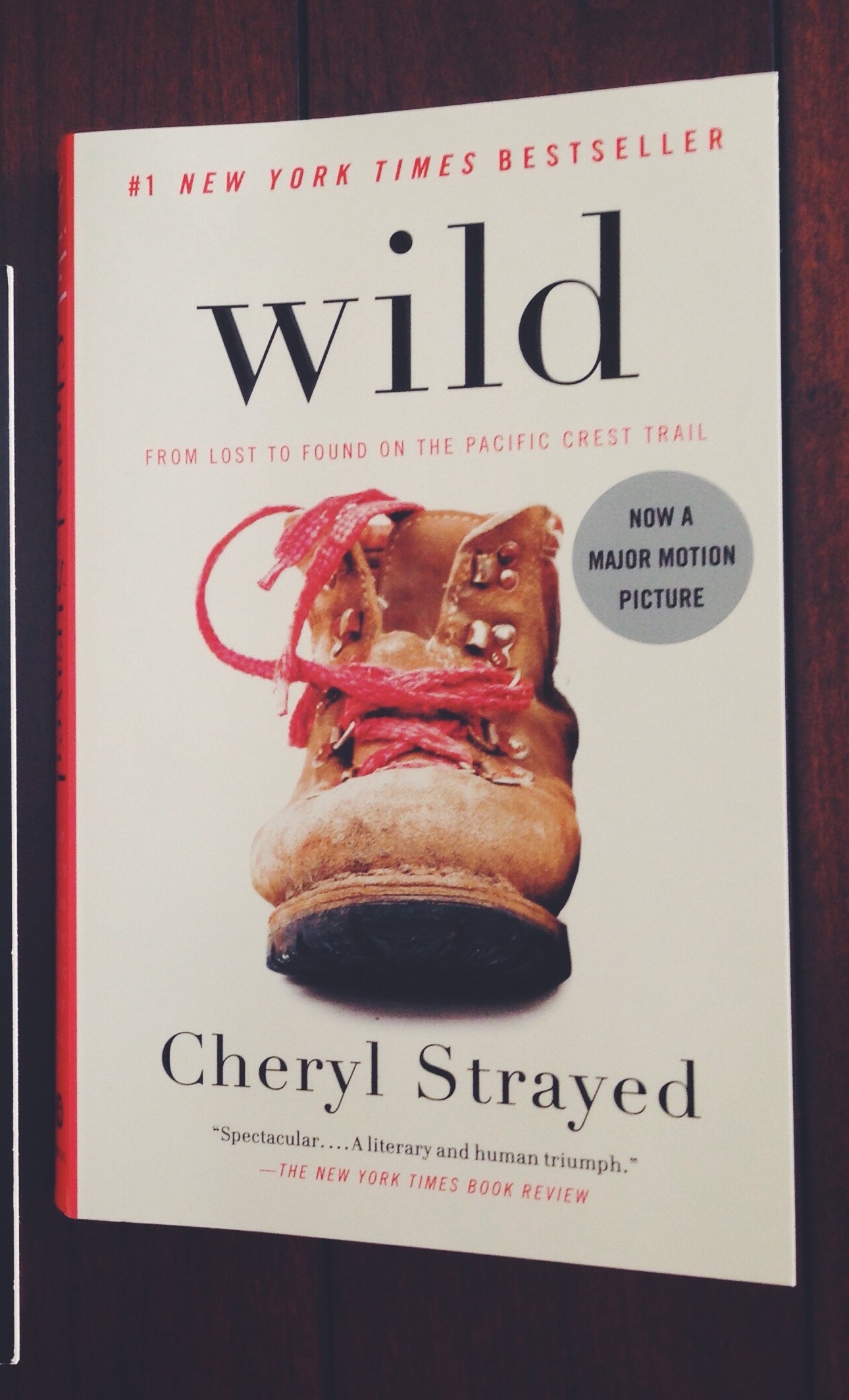
4. Wild — Cheryl Strayed
I was initially drawn to this book because of the simplicity of the cover. I like the font and the choice to leave the “w” in “wild” lower-case. I also love the basic boot and how central her boots were to her travels.
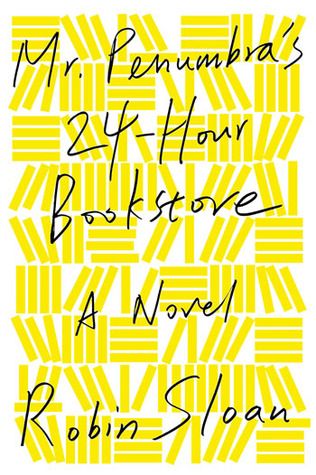
5. Mr. Penumbra’s 24-Hour Bookstore — Robin Sloan
This book cover is so simply done, and I love it. (If you couldn’t tell, I really like simple.) I also do really love this font, but I really really like that the background is comprised of many, many books as well.
Leave a comment below of you favorite fonts or book covers. I would love to hear them!
Happy reading,
Kimberly


12 Comments
futbol.run UEFA Youth League - Kristers Tobers
DOMINIC KING: Brad Jones has vowed to fight for his Liverpool future and use his unexpected return to action to show he can win a new deal. Brad Jones vows to win a new deal after surprise return as Liverpool keeper
Football Solutions UEFA EURO 1972 - History - Statistics
As hapless Liverpool goalkeeper Adam Bogdan watched an Exeter City corner kick fly into his net on Friday, few could have predicted the butterfly effect that would ripple across Scottish football. Liverpool manager Jurgen Klopp sends a ripple through Scottish football by recalling goalkeeper Danny Ward from Aberdeen
醫學美容-新生-私密-cosmetic-wiki
【Ocean Bomb】海賊王惡魔果實軟糖系列~萊爾富限定航海王軟糖 Q彈酸甜好好食 包裝圖樣一次收集完美Get – 美妝保養殿堂 – FashionGuide 華人時尚專業評鑑 海賊王可是女王小時候看的卡通,雖然現在還是會看重播拉!!,推出只在萊爾富限定的航海王軟糖,
醫學美容 紮帶 cosmetic.wiki
LANCOME 蘭蔻 【超水妍舒緩保濕系列】超水妍舒緩保濕活化乳(水潤型) HYDRAZEN NEOCALM MILK LOTION VERY MOIST的商品介紹 UrCosme (@cosme TAIWAN) 商品資訊 LANCOME 蘭蔻,超水妍舒緩保濕系列,超水妍舒緩保濕活化乳(水潤型) HYDRAZEN NEOCALM MILK LOTION VERY MOIST
醫學美容 水微晶 cosmetic.wiki
109311 109495 控油暗瘡系列 – Bicelle, Bioderma, Exuviance, Endocare, iS Clinical, NeoStrata, SkinCeuticals, SkinMedica 控油暗瘡系列
Wealth Link Credit 富通信貸 » 貸款需知
大眾財務以優惠之利率向購買物業或物業套現之客戶提供樓宇按揭貸款.
brinasbooks
Your blog is beautiful! I’ve tagged you to do the Sunshine Blogger Award; you can find my post here: https://brinasbooksblog.wordpress.com/2015/09/24/sunshine-blogger-award/
Kim Honiball
Thank you so much!
SciFi and Scary
That cover on Fahrenheit 451 is awesome. Good choices overall! (I didn’t even think of just doing the cover. I just didn’t do it because I’m not a huge fonts person.)
Kim Honiball
I rarely do the actual challenge because I rarely have enough books to cover. But I love being in the community!
sue's reading corner
Fahrenheit 451 has a pretty ingenious cover! 😉😁
Kim Honiball
It’s so great!